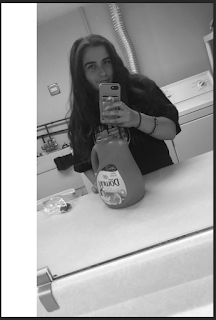
BW to color project
BW:
Compound:
Analogous:
Complimentary:
Artist statement:
I had no idea what picture I wanted to use for this project. I was going through all my pictures and I saw this one. I thought it would be easy to change everything into colors because there was not a lot of items in the picture. I used compound, complementary, and analogous from the color wheel to decide each color palette. My favorite is the compound picture because I like how you can't see anything in the background and the overall simplistic look it gives. The analogous picture was the hardest one for me. The tool I used was not selecting the face the way I wanted it to. Also when I added the background I had to go to the black and white mask to color in the mistakes that I had made with the tool I was using. When I first made the complimentary picture, I accidentally cut some of the images out when I was making the white part on the side so you cant see the washing machine. I didn't know how to fix it so I left it as is.
For each image, I basically only used the quick selection tool and the brush tool. I also used the text tool for the text on the side to name which type of color palette I used. At first, I had issues with the quick selection tool but I got the hang of it by the third picture I had done. I know each picture has tiny mistakes with the coloring but I just could not figure out how to fix them. I did try my best though to get the colors to match and have no overlapping.


Comments
Post a Comment