Portfolio
Artist statement:
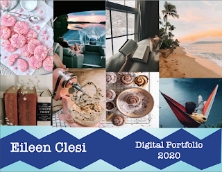
My favorite color is blue so I decided that my portfolio should also have different shades of blue incorporated into it. I had tried to create a wave look but the way I created it I didn't like how it turned out so I went with the zig-zag look. I love the gradient look I created. I think my biggest problem with the portfolio was that I created 4 different layers for background, text, and pictures. I wanted to keep the same layout for each page. I think the American typewriter is my favorite font so everything is in that font. I was never on the right layer. I kept forgetting to switch the layers and lock the layers that I wasn't using. I did have a problem with adding each business card into the portfolio but after playing with the setting I figured it out. I started with creating all the pages and the background and the background design. After I finished that I added every picture to its assigned page and then I added the text. I didn't really know what to do with the back cover so I just kept it simple. I used the gradient tool, the pen tool, and the text tool for the final project.


Comments
Post a Comment