Posts

Showing posts from October, 2020

BW to color project

Image
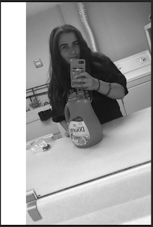
 BW:  Compound:  Analogous:  Complimentary:  Artist statement:  I had no idea what picture I wanted to use for this project. I was going through all my pictures and I saw this one. I thought it would be easy to change everything into colors because there was not a lot of items in the picture. I used compound, complementary, and analogous from the color wheel to decide each color palette. My favorite is the compound picture because I like how you can't see anything in the background and the overall simplistic look it gives. The analogous picture was the hardest one for me. The tool I used was not selecting the face the way I wanted it to. Also when I added the background I had to go to the black and white mask to color in the mistakes that I had made with the tool I was using.  When I first made the complimentary picture, I accidentally cut some of the images out when I was making the white part on the side so you cant see the washing machine. I didn't know how to fix it so I le

Tag Brush Project

Image
Logo:  Tag brush:  Color tag brush:  Artist statement:       Can I just say I love how this turned out! The color tag brush looks so cool! I created this logo in a previous project. For this project, I created a tag for my remaining projects. The tag brush is my signature for my remaining digital art projects. My favorite color brush is the bottom right. I used a magenta color first then a sky blue but moved the brush a little to the right. Then I added a bright yellow to the and I moved the brush downwards to create the finishing touch.        I did have some problems with creating the brush. I did all the steps and I realized I didn't change the document to the grayscale which messed up the brush because the different layers I added were seen. I then redid everything in the right document (rdg color) and it turned out amazing. Oh, I also had to change all the stokes in the original logo so the viewers could clearly see the image and the different colors.  

photoshop tutorials videos

 Learn photoshop in 5 minutes beginner tutorial https://www.youtube.com/watch?v=KAmSB5MQxOo This video is so fast paced that I could barely keep up plus the narrator has an accent that I  could not understand but I tried my best. Control N is to make a new document. Control j duplicates a layer. Click and drag in image into photoshop. Control U is to change that hue or saturation of a picture. Control U will help me with our project this weekend by changing the color of the pictures.  Photoshop how to cut out an image - remove delete a background: https://www.youtube.com/watch?v=Hw0-SehGcgg&t=331s I really like how this video the mouse and the bottom he was pressing on the screen for the viewers to see what he was pressing to get what he wanted done. The narrator uses the magnetic lasso tool he uses it to determine what he wants to cut out of the image. I think it will be an easy tool to use and very helpful to use photoshop. He clicks an image at the bottom called layer mask to ha

Self Propaganda Poster

Image
 Picture:  Propaganda poster:  Artist statement:  Women's rights is an important movement for me. I began interested in fighting for women's rights by watching the U.S Women's National Soccer team and what they have been going through with fighting for equal pay. The U.S Women's national soccer team has won 2 world cups in the past 8 years while the Men's National Soccer team didn't even qualify for the last world cup. The men's team gets paid a significant amount more than the Women's team. I was looking up quotes about women's empowerment and I saw this one and it stuck with me. I decided to make a storm cloud with lightning bolts on the top and then sun on for the light on the bottom. My poster is a maximalist propaganda poster.  The tools I used for this project is the was the pen tool, the curvature tool, rectangle tool, text tool, gradient tool, ellipse tool, and the bloat tool. I used the gradient tool for the eyes and the lips. For the cloud

Logo project

Image
 mood board:  hand drawings:  Black and white logo:    color 1 logo:  color 2 logo: Artist statement:  I originally was going to go with my bookish theme for my logo but I did not like how it turned out. I went with my second option which was the nature design. I really liked the logo I created for it and I thought it would be easy to design. I really like the mountains and the night sky so I  wanted to incorporate it in my logo. I had left open space on the bottom of the circle so I thought I would create some waves for an ocean look.  I had problems with getting the original black and white logo onto another layer so I can do add the colors to it. I do not remember what I did or pressed to get it on the other layers. I also had problems with coloring the entire object I think it was because they were not closed paths and I did not want to close them. Instead, I just changed the stroke size and the colors of the stroke.  The tools I used to create this logo was the ellipse tool, the p

Calligram Project

Image
  Project: Calligram (I don't know why it looks so bad in the png)  Redo:    Inspiration: Artist statement:  When I get out of college I want to work in New York for a book publishing company. I am a huge book nerd. I have a book subscription box, where every month I get a book and 5 bookish items. This notebook came with my august box and I love the cover of it. So I tried to recreate it but instead of the hand, I wanted to have buildings to look like I'm in the city. The calligram is an open book with skyscrapers coming out of the pages. It is kind of like a backward pop-up book for children. I also added waves to look like grass so it was not boring. This was actually pretty easy to create. After I struggled with the other homework assignments, I finally got the hang of it for this project.  The tools I used to create this piece of art on illustrator is the pen, the ellipse tool, the curvature tool, and the type on path tool. The pen I used to create the book and the buildin