Logo project
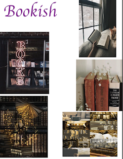
mood board:
hand drawings:
Black and white logo:
color 2 logo:
Artist statement:
I originally was going to go with my bookish theme for my logo but I did not like how it turned out. I went with my second option which was the nature design. I really liked the logo I created for it and I thought it would be easy to design. I really like the mountains and the night sky so I wanted to incorporate it in my logo. I had left open space on the bottom of the circle so I thought I would create some waves for an ocean look. I had problems with getting the original black and white logo onto another layer so I can do add the colors to it. I do not remember what I did or pressed to get it on the other layers. I also had problems with coloring the entire object I think it was because they were not closed paths and I did not want to close them. Instead, I just changed the stroke size and the colors of the stroke.
The tools I used to create this logo was the ellipse tool, the pen tool, the curvature tool, the star tool, and the paintbrush tool. I used the ellipse tool to create the circle. I used the star tool to create the stars. I used the paintbrush tool to make the clouds and the snow line. I used the curvature tool to create the waves from the ocean. I used the pen tool to create the mountains.


This is such a pretty logo! I love how there are a lot of different elements to make it engaging and memorable, yet it doesn't feel overcrowded. The colors that you chose for each play really well together, but I have to say my favorite is the black and white. This is definitely something I can see being made a a sticker. Great job!
ReplyDelete