Posts

Portfolio

Image
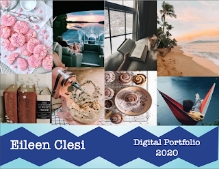
Artist statement:  My favorite color is blue so I decided that my portfolio should also have different shades of blue incorporated into it. I had tried to create a wave look but the way I created it I didn't like how it turned out so I went with the zig-zag look.  I love the gradient look I created. I think my biggest problem with the portfolio was that I created 4 different layers for background, text, and pictures. I wanted to keep the same layout for each page. I think the American typewriter is my favorite font so everything is in that font. I was never on the right layer.  I kept forgetting to switch the layers and lock the layers that I wasn't using. I did have a problem with adding each business card into the portfolio but after playing with the setting I figured it out. I started with creating all the pages and the background and the background design. After I finished that I added every picture to its assigned page and then I added the text. I didn't really know wh

Business Card

Image
 Sketches:  1 Business Card: FRONT  1 Business Card: BACK  2 Business Card: FRONT  2 Business Card: BACK  3 Business Card: FRONT 3 Business Card: BACK  Artist Statement:      When I started my sketches I knew that I wanted to go with a simplistic design for all three of my business cards. I don't really like business cards that have a lot of different things going on so I tried to keep the design really simple. I got my inspiration for each card on Google. The first card kind of reminds me of Joker with purple and green colors. It was really simple to make. I just made two different triangles and moved them where I wanted them. I copied and pasted my logo onto each business card.  For the second business card, I went to illustrator because I knew it had the preset stars and I copied and pasted it in Indesign where I wanted it. I knew it would take me forever to draw the stars out in the document and it would never be perfect so I went with the easier way. I really like the black, g

indesign videos

 https://www.youtube.com/watch?v=AshfNo-i8Ws  Learn how to use the basic tools in Adobe InDesign  The narrator says it's basically the same as photoshop. It seems a little bit easier to use when adding colors than photoshop. The pencil tool is a freehand shape that seems easy to use. Smooth tool smooths out the pencil tool. You can rotate shapes. The sheer teel seems cool.  This video is very helpful in showing all the different tools in InDesign.   https://www.youtube.com/watch?v=mVW8AF2TMnw Get started with 10 beginner tips for Indesign  Alt and shift are to make copies. You can change the case of the text. I would want to reference this video when I start working with text for my projects. We can create drop shadows on shapes just like photoshop. We can create tables in Indesign through the table tab on top of the screen. What's a bleed and slug? File place is how you add images into InDesign.   https://www.youtube.com/watch?v=f7vDA7Bjsls How to use Adobe InDesign CC for beg

Somewhere

Image
 My picture:  The Movie Scene:  Final Image:  Artist Statement:  So I originally decided that I was going to do a scene from the Harry Potter movies. When I was working on it, I got so frustrated with the lighting and the way it looked. So I decided that I was going to do pick a different scene. I googled Gilmore Girl scenes sitting and I saw this image and I thought it would be perfect to photoshop myself into. Gilmore Girls is one of my favorite shows and I've always wanted to be Lorelai's daughter. In this scene, I could make it look like I was her daughter.  The thing was I had to take a picture for it which took forever because none of my pictures that I already had would match up. It took me a couple of tries to get it right but I think it came out pretty good. I had some problems though with attaching layers to the mask it kept copying the layer instead of attaching it. It took a while but I got it to attach.  The tools I used for this quick selection tool and the brush

pre somewhere

Image
 hard: This picture looks hard to photoshop me in because of all the dark things around the person and there are too many objects around the person. Idk I think I would have a hard time doing it.   inspiration: I really liked this image mostly because of all the kitties. I know I have running pictures on my phone so I could try to find a movie shot that I could photoshop me running away from something.  laugh: I don't know I just thought this one was funny.   illusion: I thought this one was more realistic to create. I think I would be able to find all these things around my house so I wouldn't have to buy anything or go anywhere to create the photo. 

Autoscopy

Image
 Original Images:   New photoshop version:  Artist Statement:  Lately, I have been creating scenarios in my head and with this project, I was able to create what I think is happening. So I think that the goddess of inspiration is pouring inspiration and creativity around me. The sprinkling of colors represents the creativity that is hitting me.  The books flying around me represent the stories I could write but I'm probably not going to.  The butterflies represent the inspiration flying away from me when I  have to focus on schoolwork. I really like how this turned out.  The tool I mainly used was the quick selection tool and the brush tool. I first put the background in then the books, then the teapot, then my picture, then the colors, and then the butterflies. I had to most trouble with the colors pouring on my face. I didn't know how I wanted it to be placed so I ended up redoing the part three times. For most of the items, I just lowered the opacity to blend in. The last pa

BW to color project

Image
 BW:  Compound:  Analogous:  Complimentary:  Artist statement:  I had no idea what picture I wanted to use for this project. I was going through all my pictures and I saw this one. I thought it would be easy to change everything into colors because there was not a lot of items in the picture. I used compound, complementary, and analogous from the color wheel to decide each color palette. My favorite is the compound picture because I like how you can't see anything in the background and the overall simplistic look it gives. The analogous picture was the hardest one for me. The tool I used was not selecting the face the way I wanted it to. Also when I added the background I had to go to the black and white mask to color in the mistakes that I had made with the tool I was using.  When I first made the complimentary picture, I accidentally cut some of the images out when I was making the white part on the side so you cant see the washing machine. I didn't know how to fix it so I le