Business Card
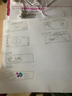
Sketches:
1 Business Card: FRONT
1 Business Card: BACK
2 Business Card: FRONT
2 Business Card: BACK
3 Business Card: FRONT
3 Business Card: BACK
Artist Statement:
When I started my sketches I knew that I wanted to go with a simplistic design for all three of my business cards. I don't really like business cards that have a lot of different things going on so I tried to keep the design really simple. I got my inspiration for each card on Google. The first card kind of reminds me of Joker with purple and green colors. It was really simple to make. I just made two different triangles and moved them where I wanted them. I copied and pasted my logo onto each business card. For the second business card, I went to illustrator because I knew it had the preset stars and I copied and pasted it in Indesign where I wanted it. I knew it would take me forever to draw the stars out in the document and it would never be perfect so I went with the easier way. I really like the black, gold and blue together. For the third business card, I didn't really know what I wanted to do and I watched the tutorial. I really liked how the gradient turned out in the video so I thought I would give it a try. I think it turned out really well.
The tools I used for the business cards are the line tool, the gradient tool, the pen tool, and the text tool. One occurring problem I had with the project was that I kept forgetting to switch the layers on Indesign on what I was working with because I made a layer for each specific thing I did. I used the pen tool to create the triangles and the diamond. I was really confused about the packaging of the files but I figured it out. I think the gradient business card is my favorite.


I think all your business cards turned out great. My favorite one is the first one because it looks very modern yet simple and the two colors you chose for the geometric shapes compliment each other very well. My only suggest would be to add more artistic features to the last business card because it looks a little bare or maybe just make your logo bigger on the back because there is a lot of empty space.
ReplyDeleteI really love your first business card. I really like how the colors you chose work well together and I think the simplicity of it makes it super easy to look and for someone to gather information from. I think they came out great! My only suggestion would be for the last business card to adjust the spacing of "upon" in the front.
ReplyDelete