Tag Brush Project
Logo: 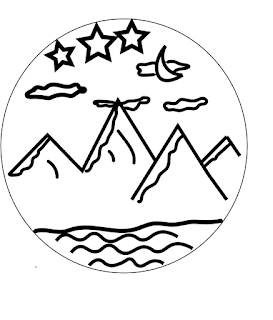

Tag brush: 

Color tag brush: 

Artist statement:
Can I just say I love how this turned out! The color tag brush looks so cool! I created this logo in a previous project. For this project, I created a tag for my remaining projects. The tag brush is my signature for my remaining digital art projects. My favorite color brush is the bottom right. I used a magenta color first then a sky blue but moved the brush a little to the right. Then I added a bright yellow to the and I moved the brush downwards to create the finishing touch.
I did have some problems with creating the brush. I did all the steps and I realized I didn't change the document to the grayscale which messed up the brush because the different layers I added were seen. I then redid everything in the right document (rdg color) and it turned out amazing. Oh, I also had to change all the stokes in the original logo so the viewers could clearly see the image and the different colors.

I love the way this came out! The contour lines in the mountain make it look realistic but still simple, along with the texture of the clouds. My favorite tag brush is the one with the red yellow and blue colors, it makes it look 3-D.
ReplyDeleteI love your logo and how much depth is created within your logo when you made it into the tag brush. The combination of the negative and the scratches add a distressed look to your logo. With that distressed look paired with the logo you have are a great mix. I love the choices of colors and how you layered them with the test. Vey mice tag brush. Great work.
ReplyDeleteThis looks really great! I think your logo is very aesthetically pleasing, and has a lot of great detail. I also really love how you layered the different colors when experimenting with the tag brush, it gave a really cool effect!
ReplyDelete